Typography serves as a crucial element in graphic design, significantly impacting the way messages are perceived and interpreted by audiences. Understanding typography principles can greatly enhance the visual appeal of any design project, making it more effective in conveying its intended message.
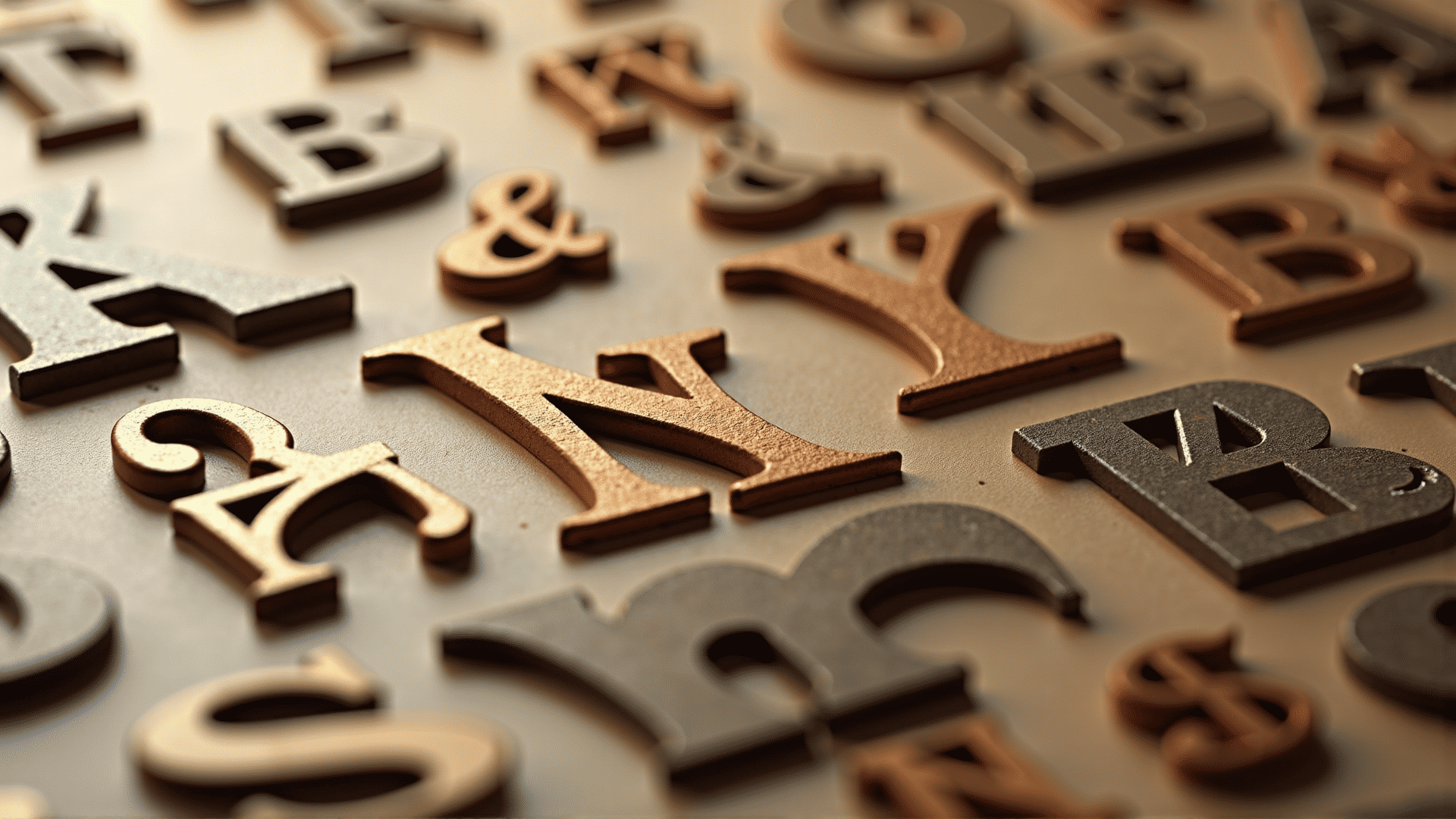
One of the fundamental aspects of typography is the selection of fonts. Different font styles evoke different emotions and set various tones for the content they accompany. Serif fonts, with their traditional and formal appearance, are often used in print media as they offer a sense of reliability and professionalism. On the other hand, sans-serif fonts are typically seen as modern and clean, making them popular in digital media. Script fonts can add a touch of elegance and personal flair but should be used sparingly to maintain legibility.
Aside from font choice, typography involves the artful arrangement of text within a design. This includes considerations of line spacing, letter spacing, and alignment. Proper line spacing, or leading, ensures that text is easy to read and that the flow of content is smooth. Letter spacing, or kerning, needs to be adjusted to avoid any letters being too cramped or too distant from one another. Alignment of text can also influence the overall aesthetic; for instance, centered text might evoke formality, whereas left-aligned text often appears more casual and accessible.
Hierarchy is another crucial typography principle. It guides the viewer’s attention, helping them understand which parts of the text are most important. Achieving a clear hierarchy can be done through variations in size, weight, and color. Large, bold headlines grab immediate attention, while smaller, lighter text supports the headline with additional details.
Color plays a significant role in typography, too. The right color can enhance the readability of the text and reinforce the design's message. It's important to ensure sufficient contrast between the text and its background, making sure that the content is legible under varying lighting conditions.
The expressiveness of typography extends into how it pairs with other design elements. A balanced combination of text and images can create a harmonious and visually engaging composition. Designers often experiment with overlapping text and images or aligning text along the contours of graphics to enhance the storytelling aspect of their design.
To fully appreciate the impact of typography, one must consider the broader cultural and historical contexts of fonts. Every typeface embodies a story and a specific zeitgeist that can enrich the message it communicates. This is particularly evident when using fonts inspired by a certain era or geographic location, where they can effectively evoke nostalgia or a sense of place.
Ultimately, mastering typography principles is not just about selecting a beautiful font or perfectly aligning text. It's about creating a visual language that effectively communicates the desired message and resonates with the audience. By paying close attention to typography, designers can elevate their work and ensure their messages are both seen and felt in the intended manner.