Color theory holds a significant place in the world of design, serving as a crucial tool for creators across various fields. This practice delves deep into how colors interact, the emotions they evoke, and the meanings they convey, playing an indispensable role in visual storytelling.
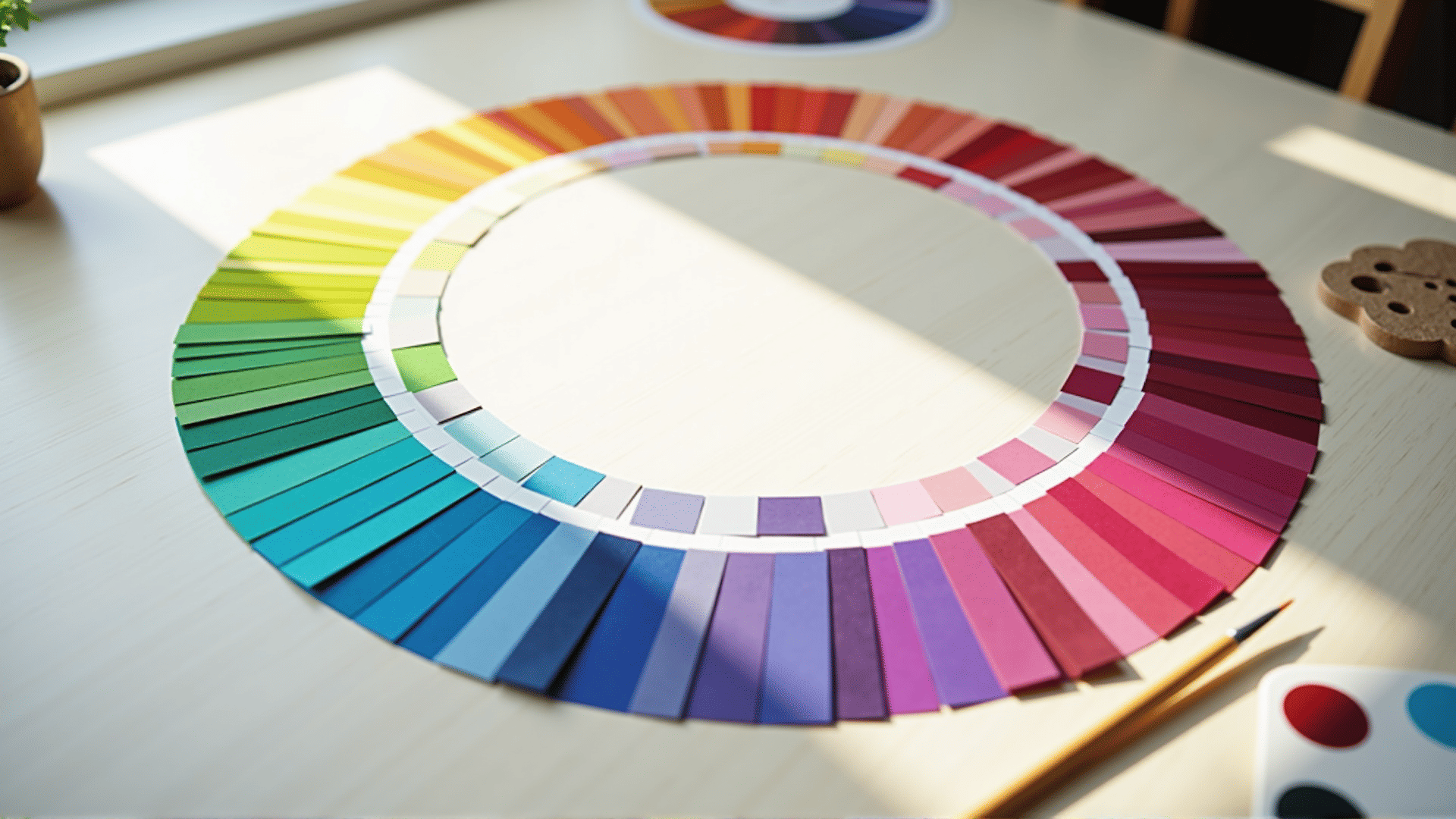
At its core, color theory offers guidance in selecting color combinations that are aesthetically pleasing and communicative. It begins with the color wheel, a visual representation of colors arranged according to their chromatic relationship. Primary colors—red, blue, and yellow—form the foundation, which when mixed in various combinations, yield secondary and tertiary colors. Understanding these relationships lays the groundwork for crafting compelling visuals.
One of the essential aspects of color theory is its ability to impact mood and perception. Warm colors like red, orange, and yellow are often associated with energy, warmth, and enthusiasm, while cool colors such as blue, green, and purple invoke tranquility, professionalism, and calmness. By harnessing these elements, designers can build environments and products that resonate with the intended audience's emotions and expectations.
Beyond aesthetics, colors can also carry cultural and contextual meanings. Red might symbolize luck in one culture while representing caution or danger in another. Green, commonly linked with nature, can also suggest wealth or envy, depending on its use. Designers adept in color theory consider these nuances, ensuring their work communicates effectively across different contexts and audiences.
The role of contrast in design further underscores the importance of color theory. Effective contrast enhances readability and draws attention to key elements without being overpowering. This balance is critical in guiding the viewer's focus and ensuring the message is conveyed clearly.
Moreover, colors contribute to creative expression by offering endless possibilities for innovation. Through experimental combinations and thoughtful application, designers can create unique identities and narratives that distinguish their work. The blend of intuition and understanding of color principles enables designers to craft visuals that are not only appealing but also meaningful.
In summary, color theory is more than just a guide to picking colors that look good together. It's a comprehensive framework that helps designers navigate the complexities of visual communication. By understanding the psychological and cultural implications of color, designers can create works that engage, inform, and inspire, leading to more effective and impactful creations.